When we look back at past website projects, the biggest improvements rarely came from dramatic redesigns.
Most of the time, the layout was solid. The messaging was clear. The offer made sense.
But something felt slightly disconnected.
In many of those cases, the issue came down to color. Not bold mistakes. Subtle ones. The kind that affects clarity, confidence, and conversion without anyone realizing it.
Here are three principles we consistently apply.

Strong Hierarchy Beats Busy Design
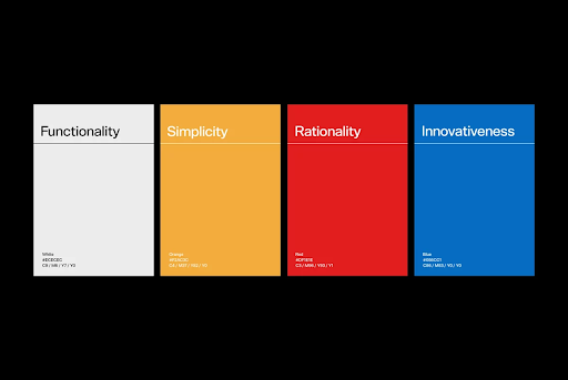
One of the most common pitfalls we see in landing pages and product interfaces is overusing brand colors. The intention is good. Teams want their identity to feel present, so every section gets its own shade, every block carries a different hue. But in practice, buttons start competing with headlines, and backgrounds start fighting calls to action for the same slice of attention.
The result is visual tension, and visual tension costs you conversions.
When everything tries to stand out, nothing does. The eye has no clear path to follow, so it wanders. And a wandering eye rarely ends in a click.
What actually works is restraint. Start with a neutral foundation that lets your content breathe. Introduce one consistent brand color to anchor identity. Reserve one distinct action color exclusively for the things you want users to do. The goal is not to impress with variety but to guide with intention.
This principle matters because clarity is a form of respect for your users' time. When someone lands on your page and instantly knows where to look, what to read next, and where to click, friction disappears. They spend less time decoding the layout and more time engaging with your message. That reduction in hesitation, even a few seconds of it, directly translates into higher engagement, longer sessions, and better conversion rates.
Hierarchy is not a design choice. It is a business decision.

Color Sets the Tone Before Copy Does
Before a user reads a single word on your page, they have already formed an impression. That impression is shaped almost entirely by color.
Across projects in different industries, we have seen this play out consistently. Color does not just decorate a design. It directly influences how credible, trustworthy, and relevant a brand feels within the first few seconds of a visit. Deeper, muted tones tend to reinforce authority and seriousness. Softer, lighter palettes communicate approachability and warmth. High contrast combinations signal energy, boldness, and confidence. This is why a legacy financial institution relies on deep navy blues to signal security, while a modern fintech startup might use vibrant mint greens to feel frictionless and disruptive. None of this is accidental, and none of it is trivial.
The reason this matters so much is that color either reinforces your positioning or quietly undermines it. If your brand promises innovation but your visual tone feels dated and flat, users sense that misalignment even if they cannot name it. If you are positioning for a premium audience but your palette feels loud, cluttered, or inconsistent, trust erodes before your copy ever gets a chance to build it back.
This is why color decisions should start with your brand promise, not your personal preferences or trend boards. Ask what feeling your product needs to create on first contact, then build your palette around that answer. When the emotional tone of your colors matches what your copy and product actually deliver, everything feels coherent. Users do not have to work to understand you. They simply feel it.
That coherence is what turns a first impression into a lasting one.

Consistency Builds Intuition
One of the most impactful refinements we make in design reviews is surprisingly unglamorous: tightening how accent colors are used across a product or website.
It sounds like a small thing, but the effects compound quickly. When primary buttons shift color from page to page, users pause, even briefly, to reorient themselves. When important actions blend visually into decorative elements, momentum stalls. These are not dramatic drop-off moments. They are quiet friction points that accumulate across a session and slowly erode the confidence a user needs to convert.
The fix is not complicated, but it requires discipline. Assign one consistent color to primary actions and protect it. Do not let it appear on banners, illustrations, or background accents. Reserve it entirely for the moments where you need the user to do something. Over time, users build an unconscious association between that color and the next step forward. Navigation starts to feel effortless because the interface is teaching them where to go without making them think about it.
The results of this kind of refinement are more measurable than most people expect. In more than one project, small adjustments to contrast levels and color placement led to meaningful increases in clickthrough rates without a single line of copy being rewritten or any content being restructured. The product stayed the same. The clarity of the visual language improved, and that alone moved the numbers.
That is the real impact of visual discipline. It does not just make a design look better. It makes the entire experience work harder.
Color is not about decoration. It is about direction.
It shapes how your brand is perceived the moment someone lands on your page. It determines how naturally users move through your content, how quickly they understand what you offer, and ultimately whether they take action or leave without a word.
If your traffic is solid but your conversions are lagging, you might have a clarity issue. Not a product issue. Send us your URL for a zero-obligation visual system audit. We will tell you exactly where your design is working and where it is quietly costing you clicks.